WebMYnd 公司設計 Logo 的過程
本文轉載自 http://webdesignerwall.com/tutorials/dache-logo-design-process
Getting started
Initially, I took the brief at face value and brainstormed some ideas. I wanted to create a concept using the initial from WebMYnd and the first concept which was produced as as follows. The simple lines created an abstract reference to a brain (an idea which the client had experimented with but did not like the appearance of a brain. This design captures the essence of a brain but at the same time forming a ‘W’.

This concept was discontinued however as the ‘W’ was not clear enough and it did not have the presence that the client was looking to achieve. I therefore focused on colour and did some research for inspiration.
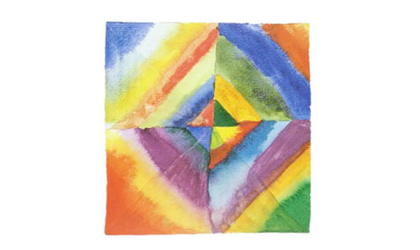
I am a great fan of the works of Wassily Kandinsky, a Russian artist, printmaker and theorist. One of the most famous 20th century, Kandinsky has been credited with painting the first modern abstract works. Below is one of these works from which I took inspiration as to the colour palette which may suit the WebMYnd logo. The use of colour is broad yet it is not offensive on the eye and stands out enough to intrigue the audience. This is what I wanted to achieve so all I needed now was the correct design to show these colours.
Drafting and development
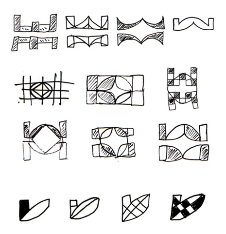
I consulted the client and the idea of creating a monogram using the ‘W’ and the ‘M’ was decided on to take the project forward. Below are my initial sketches.

The first of these above gave the best line to work with however I did not like the linear aspect as I would be unable to use enough variation of colour within a single lined image. Below are my developments of the first idea into a two dimensional concept and intersecting these shapes with differing elements to allow me to fill with colour.
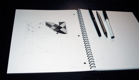
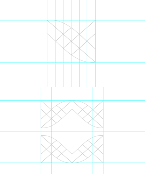
After some re-drafting of one of the concepts, i decided on a wholly symmetrical design where the ‘W’ mirrored the ‘M’ therefore I transferred the design to the Dot Grid Book below. As the design had four elements which were identical in design, I was able to just concentrate on one element which could be copied and rotated at a later stage using the computer software.
Colours
Once the four elements were plotted and finalised, I looked at possible colours. Below are some combinations which I experimented with.
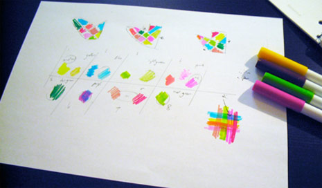
I finally decided on the colour scheme below using quite vibrant colours to create a presence but trying not to use garish tones which would offend the eye of the audience.

Final colour placement and concept presentation
I tried many combinations. When dealing wit the use of colour in this quantity, it is a case of trying until you find the right solution. Below is the finished design which was selected by the client.



留言